

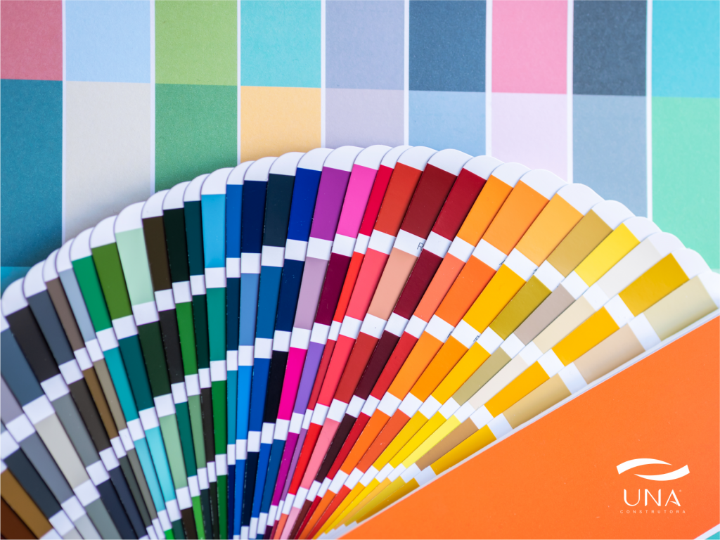









To the Colors directly influence our emotions and behaviors..
They affect the perception of the environment and well-being at home, completely transforming the way we experience a space.
In addition to defining the style of the decoration, Colors also impact the mood and energy of the residents..
Therefore, Understanding the psychology of color. It is essential for create balanced and welcoming environments.
Next, find out how each color acts in the home environment and learn Applying them strategically to harmonize your home and your emotions..
The Psychology of Colors and Their Emotional Influences
Blue: Tranquility and Serenity
O blue transmits peace, balance and trust.
This color is reminiscent of sky and sea, creating a feeling of calm and freshness.
Therefore, it is ideal for bedrooms and bathrooms, where the search is conducted relaxation and rest.
Studies show that The color blue helps lower blood pressure and improves sleep quality..
However, if used excessively, he can generate emotional distance.
Therefore, combine it with warmer tones, such as beige or wood, to balance the environment.
Red: Energy and Stimulation
O red It is a color. vibrant and intense, associated with passion and enthusiasm.
She It increases energy and stimulates appetite., being perfect for kitchens and dining rooms.
Furthermore, the red It promotes social interaction., making the environment more dynamic.
Nonetheless, if applied in excess, it can cause tension or agitation.
Therefore, use red. with moderation or in decorative details, such as cushions, paintings or vases.
Yellow: Joy and Creativity
O yellow is the color of light, positivity and creativity.
He It stimulates the mind and brings a feeling of joy., being great for living rooms and home offices.
Furthermore, Yellow visually expands spaces. e makes the environment more welcoming.
On the other hand, Very intense colors can cause eye strain..
So, combine yellow with neutral colors, like white, gray or beige, to create balance and lightness.
Green: Harmony and Balance
O green is strongly linked to nature, renewal and calm.
He It brings emotional balance and reduces stress., being ideal for living rooms and bedrooms.
Furthermore, green It helps connect the environment to the idea of well-being and freshness..
Tones like light green and olive create a relaxing sensation, while moss green he adds sophistication and comfort.
In this way, the green It adapts to different decorating styles. e It maintains a serene and pleasant environment..
Orange: Socializing and Creativity
O orange unite The energy of red combined with the joy of yellow..
He It encourages social interaction and improves mood., making it ideal for living rooms and leisure areas.
Furthermore, Color enhances creativity and the feeling of dynamism..
Nonetheless, when used in excess, he can to generate a feeling of agitation.
Therefore, use orange. in small details as cushions, armchairs or decorative objects to maintain balance.
Purple: Introspection and Spirituality
O purple is associated with reflection and spirituality, in addition to transmitting sophistication and mystery.
This color It stimulates introspection and creativity., being excellent for rooms or meditation spaces.
While soft tones, such lavender and lilac, they bring calm and gentleness, dark tones They suggest elegance and depth..
However, in excess, purple can to cause melancholy.
So, combine it with white, beige or light gray for a balanced outcome.
White: Amplitude and Purity
O white It is a symbol of clarity and cleanliness.
He It increases brightness and creates a feeling of spaciousness., being ideal for small spaces.
Furthermore, It serves as a perfect base for highlighting objects and complementary colors..
On the other hand, Excessive use can make the environment feel cold or impersonal..
Therefore, combine white with natural textures and touches of color to to bring comfort and harmony.
Gray: Sophistication and Neutrality
O gray It is a color. elegant and versatile.
He It brings stability, sobriety, and calm., working well as neutral base.
Furthermore, highlights colorful furniture and elements, creating visual contrast.
Light shades of gray They make the environment modern and light., while the dark ones They enhance the feeling of coziness..
Consequently, Gray adapts easily to any decorating style..
Neutral and Beige Tones: Comfort and Warmth
Tones like beige, cream and brown refer to comfort, stability and harmony.
They They match all colors and styles., functioning as The perfect backdrop for vibrant decorations..
Furthermore, Neutral colors make the environment more welcoming and balanced..
Therefore, they are Ideal for those seeking a peaceful and timeless home..
Strategies for Choosing the Ideal Colors
Choosing the right colors It goes beyond aesthetics. é a decision that affects the well-being and functionality of spaces.
See below How to strategically apply colors in each room of the house..
Rooms: Tranquility and Rest
Choose soft tones, like light blue, green or lilac.
These colors They help you relax and promote sleep..
Avoid very vibrant colors, which They can cause agitation and interfere with the quality of rest..
Kitchen: Energy and Togetherness
In the kitchen, Warm and cheerful tones create a welcoming and stimulating environment.
Colors like yellow, red and orange They increase appetite and promote social interaction..
Furthermore, details in natural wood they bring balance and comfort.
Living Room: Comfort and Socialization
The living room should to inspire acceptance and harmony.
Use balanced colors, like beige, light green or soft blue.
About that, Focus on more vibrant details., like colorful cushions or paintings, for create points of interest and dynamism..
Office or Home Office: Focus and Productivity
Work environments demand Colors that stimulate concentration without causing stress..
Shades of green and blue They are ideal because They bring calm and balance..
Furthermore, avoid dark or vibrant colors, that They can cause eye strain and distraction..
Bathroom: Lightness and a Feeling of Cleanliness
For the bathroom, soft and light tones They work better.
Colors like white, light blue and sea green transmit cleanliness and tranquility.
On the other hand, Bold colors can be explored in accessories., creating contrast without overwhelming the environment..
Conclusion
In summary, Colors have a transformative power within the home..
They influence emotions, behaviors, and perceptions, making the environment more balanced and pleasant.
Furthermore, Using color psychology in decoration. allows Create spaces that promote well-being and functionality..
Therefore, Before choosing a color palette, consider the desired emotional effect and the function of each room..
In the end, The right color not only beautifies, but also transforms the way we experience our home..